The Sick Notes Are Sick!
One very valuable service that Maple provides are "sick notes". Sick notes are often required by our user's workplace or school in order to excuse absences. Since OHIP doesn't not cover the issuance of sick notes, it makes a lot of sense for Maple, which is a private provider of medical services, to provide this service, because we can charge for it, or include it in the consultation fee as an added bonus. A good portion of patients that come to Maple are patients looking for sick notes.
An opportunity was discovered when the design team started looking in the reviews of Maple services from various places. We had app store reviews and we also solicited our own reviews at the end of every consultation. We noticed a common pattern of users complaining about the content of our sick notes. One user reported:
The sick notes says that I say I am sick. This note is pretty much useless and was not accepted by my HR department.
This sentiment was very common amongst the other comments. The team confirmed that the content of the default sick note was “Firstname Lastname says they were sick from DATE - DATE.” We empathised with the user's complaints and saw that this note content was barely any better than no note at all.
Rather than move right away to change the content of the note, we needed to check with our other user type and that was our providers. In a way the providers are more important users than the patients themselves, since without a good provider pool, patients would not get value and Maple would not make any money.
The goal of this work therefore became: Reduce the number of complaints about sick notes to zero or near zero, while still maintaining provider satisfaction.
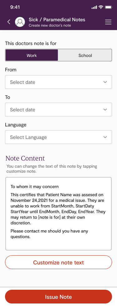
 |
| Fig 2. The new sick notes assignment page |
Speaking to users in general can be a challenge, but speaking with medical providers is even more challenging, mostly because they are extremely busy and in high demand. So for this reason, we didn’t conduct individual interviews but instead met with a provider committee that meets once per month. There were four providers on the committee and we felt that speaking with them would give us good levels of empathy for our provider users.
"The goal of this work therefore became: Reduce the number of complaints about sick notes to zero or near zero, while still maintaining provider satisfaction."
Talking with the provider comittee the main theme we heard was:
We are worried about writting notes attestings to things we cannot confirm
One idea we explored was creating a "verified" button that providers could click if they felt they were able to verify notes. We didn't end up going this way because we felt that have "unverified" notes would still not satisfy the requirements of the patient users, who were requesting more certainty in the note content.
Instead we decided to go with a different approach. As you can see in Figure 2 we made a few changes to the flow and page.
- First, we changed the note content to read with a little more certainty and we stated "They are unable to work" instead of "They said they were unable to work". We hoped this would satisfy those that complained when the sick notes note stated "The patient stated they were sick".
- Second, in the old design, the provider user had to select standard note or custom before they were brought to the note details page. If they pick standard they then have the option to pick either "work" or "school".
- Third, you'll notice the note text is not readibly viewable in the older design. Since we wanted to bring more trust to the providers by showing them exactly what they would be sending out to the patients we put the note text on the main note details page. This was especially important since we were making the note text a little more certain, and providers expressed concerns about stating things with certainty that they were not certain of. The very least we could do is show them the text they would be sending out.
- Finally, instead of introducing some sort of "verification" feature we decided to take a more general approach, again to increase provider trust, but adding a "customize note" button. This pattern is much more common and we felt it was a good balance between tending towards keeping
 |
| Fig 1. Original sick note design for providers to issue sick notes |
We user tested this design with 5 providers and they were all able to create notes very easy. Some remarked that the new process was much easier. Once we released the update to the larger provider group we started to get a lot more positive feedback. We also noticed that complains around sick notes dropped to nearly zero.