Increasing Conversion in The Consultation Flow
 |
| Fig 1. Specialities select screen |
Maple is a telemedicine company. That means that the primary value Maple brings to customers is the ability to connect with a provider through your phone or computer. Connecting patients with providers is how Maple makes money. Therefore the flow the allows for this to happen is the most important flow in the entire application. If patients cannot connect with providers, then the company cannot continue.
In the summer of 2021 product leadership tasked the design team with increasing speciality conversion, especially with specialities other than General Practitoner. Specialities like dermatology and psychiatry are quite a bit more lucrative than general practitioner so any effort to increase conversion for those types of specialities will likely result in a higher payoff.
Figure 1 shows what the original speciality selection screen looks like. As you can see its a simple list of all the specialties available on the Maple platform. When Maple first started this design made sense as the only specialty available was General Practitioner, but as Maple grew and expanded to offering more specialities, this design stopped making sense.
In order to get started with improving conversion the first thing we did is look into the backend analytics to see how the existing conversion flow was performing.
As seen in Figure 2. there are nine steps, or screens, in the "Create Consult" flow. The user needs to indicate their location, select the type of provider they'd like to see, select the specific provider, select a time for the consultation, enter their symptoms, review their submission and then pay for the consultation. Once those steps are complete the user is placed into a waiting room where they wait to be connected with that provider.
One thing we noticed right away is that there were huge 50% drop offs between the service selection and provider selection and between the time slot and symptoms entry page. This told us that we need to focus on the speciality selection screen and the time slot selection screen to see if we could change the design in a way that would increase conversion.
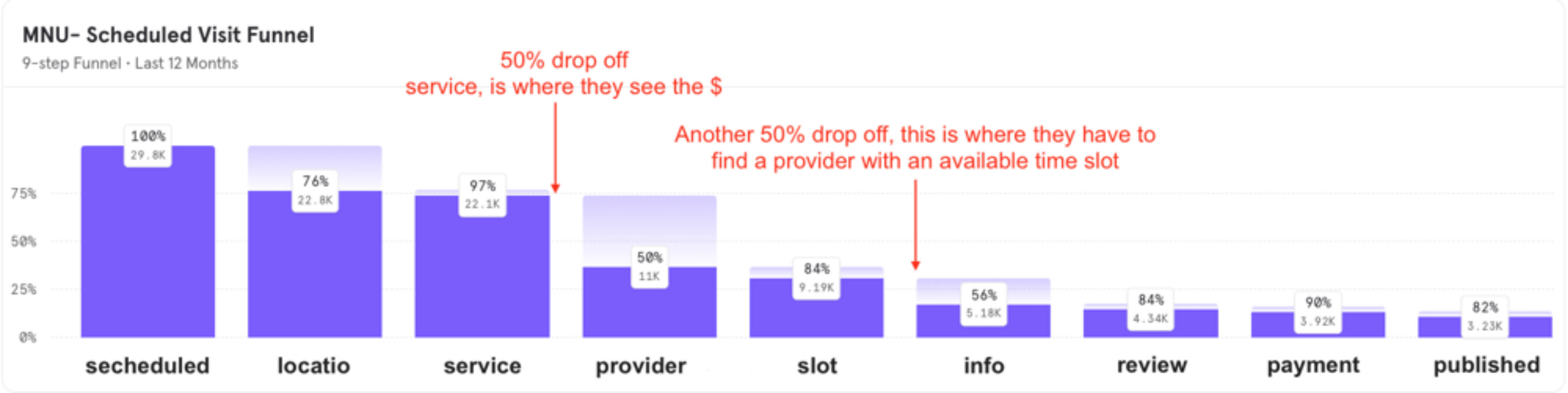 |
| Fig 2. Conversion flow analytics |
We had two working theories as to why there was significant dropoff on these pages.
First we noticed that this page was the first place where the price was displayed. We hypothesised that a certain portion of users that were coming through this flow were either just "tire kicking" and going through the flow to see the cost since the cost isn't mentioned before the user gets to this place.
Second, another portion may be turned off by the cost of the service and leave the flow once they see the price even though they were initially very interested in the service.
So in understanding that we cannot make the specialities free (I bet that would increase conversion!!) or hide the price from this page, we looked to the other potential problem, which was a very long list of about 30 specialities that a user would have to scroll all the way through. Specialties near the bottom would have almost no chance of being looked upon by human eyes, let alone have some user see them and convert to paying and using that speciality. So we began to brainstorm designs that would meet all of our requirements and goals.
One additional requirement that made this design even more challenging, came from the Clincal Operations group who actually run the day-to-day activity of the virtual clinic. They setup the specialities, write the descriptions and set the price. In the existing design they could control the order presentation of specialities and so they could highlight certain specialities by moving them to the top. They wished to have this highlighting ability remain intact with the new design.
After several iterations we landed on the design seen in Figure 3.
Notice several additions we made:
- A search feature, which when tapped on shows the old list view, and then filters that list based on the input the search field
- Two sections called "Featured" and "Specialties", the later being speciality categories that take the user to shorter lists of providers within that category. Speciality items appears in the "Featured" section if they were in the top 3 of the list of specialties.
- A "new" tag that allowed clinical operations to highlight new speacialties
- Links to see "all specialities. This was essentially a link to the old version of the page with an additional search feature added"
One of the biggest changes was the additions of the cateories. Now, with the category description, users could see that we have specialties other than General Practitioner on the first page or on the second page with just a little bit of scrolling. We felt adding the search and the categories, combined with the "Featured" section allowed us to meet all requirements while still having a very real chance of increasing conversion.
The next thing we wanted to take a look at was the time slot selection screen. Some of our specialities allowed for or required the user to book an appointment.
"Well you know what happens when you ASSUME! Not wanting to make an ass out of me or you we checked the data!"
One thing we understood about Maple and its users is that patients usually want to see a doctor right away. If they are using Maple, its likely because they have an accute issue that they want addressed immediately. There are exceptions to this rule, but we assumed this to be true for the majority of users. Well you know what happens when you ASSUME! Not wanting to make an ass out of me or you we checked the data!
Taking a look at Figure 4 you can see that the majority of users are booking within a day. 65% of users were booking within 1 day, so either the same day or the next day. Nearly 80% were booking with in 4 days and finally 98.5% were booking with in 10 days. So clearly nearly all users are using this booking screen to book appointments not that far out into the future, and so we decided that the new design should support this.
 |
| Fig 3. Specialities select screen |
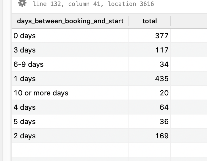 |
| Fig 4. Statistics on how far our users are making |
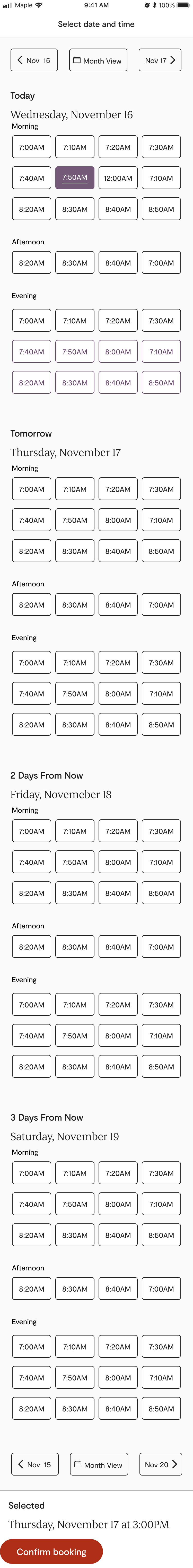 |
| Fig 5. Statistics on how far our users are making |
Looking at Figure 5. you can see the "Day View" that the design team ended up with. As you can see the headers are very clearly day centric using "Today", "Tomomrrow", "Two Days" instead of specific dates. We did this because we understood that this is much more natural way for humans to express future time periods. Calendars are more precise, but hard to use casually. The time slots where presented more saliently, as before in the calendar view, users had to pick a day first before they could see any time slots. This could lead to users looking through many days with few or no slots available, creating more frustration.
You can see that we also considered accessiblity as we added what might seem like a redundent underline under the time for the slot selection buttons. This is to help those that have trouble seeing colour contrast, as it would be a violation to have a state that is only differentiable by colour. Adding this line gave the user an additional graphical indicator that that time period was selected.
"We saw a 6.5% increase in conversion, which was projected to equal an additional $49,296 in additional monthly revenue. If we multiple that by 12 we get an annual increase of $591,552!!"
We usability tested this design by having 12 users select a time slot that was on this initial screen. We also pressure tested the design by asking them to pick dates there were outside that 10 day window, just we were sure the new design didn't cut off the minority of users that do pick dates well into the future.
We released this new design as an A/B test in order to guard against unexpected reudctions in usability or conversion, even though we were pretty confident that this was the way to go.
After release we saw a 6.5% increase in conversion, which was projected to equal an additional $49,296 in additional monthly revenue. If we multiple that by 12 we get an annual increase of $591,552! While recognizing this is revenue and not profit, even still its clear we nearly paid for an entire design team just with one project that utilized analysics and other research to redesign a portion of a converion flow.